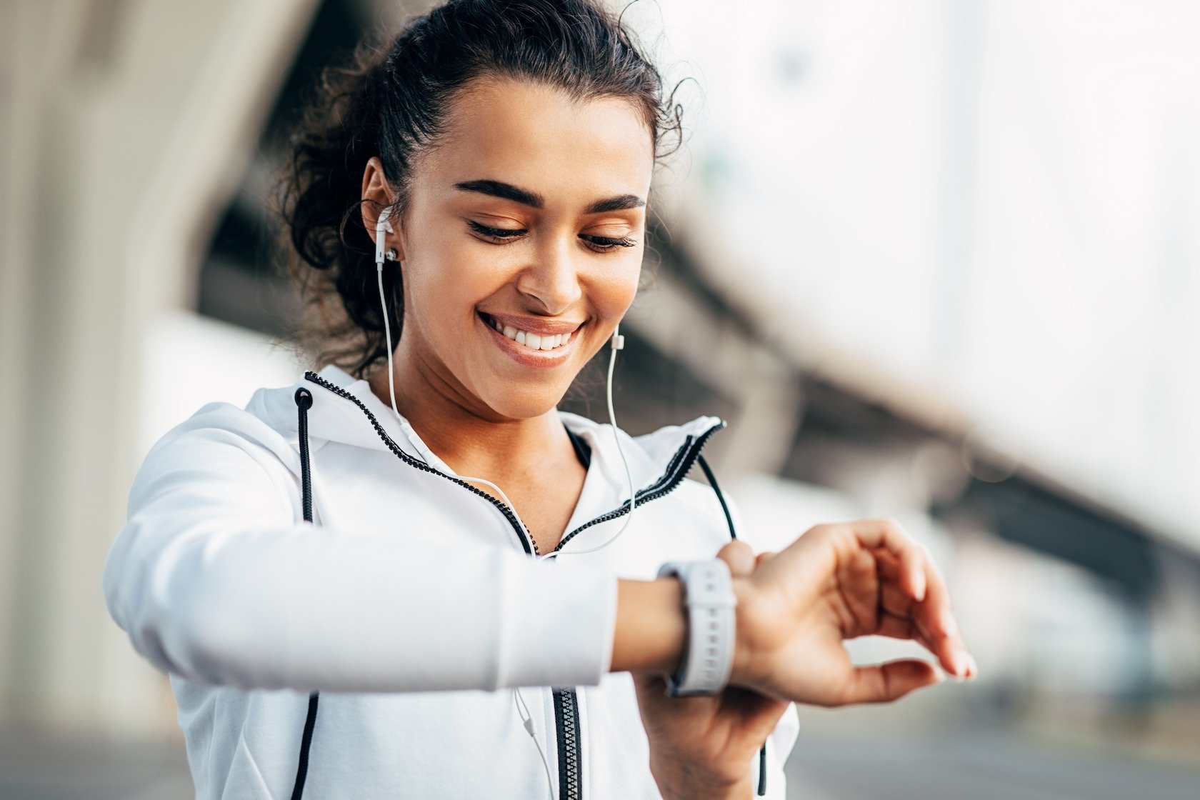
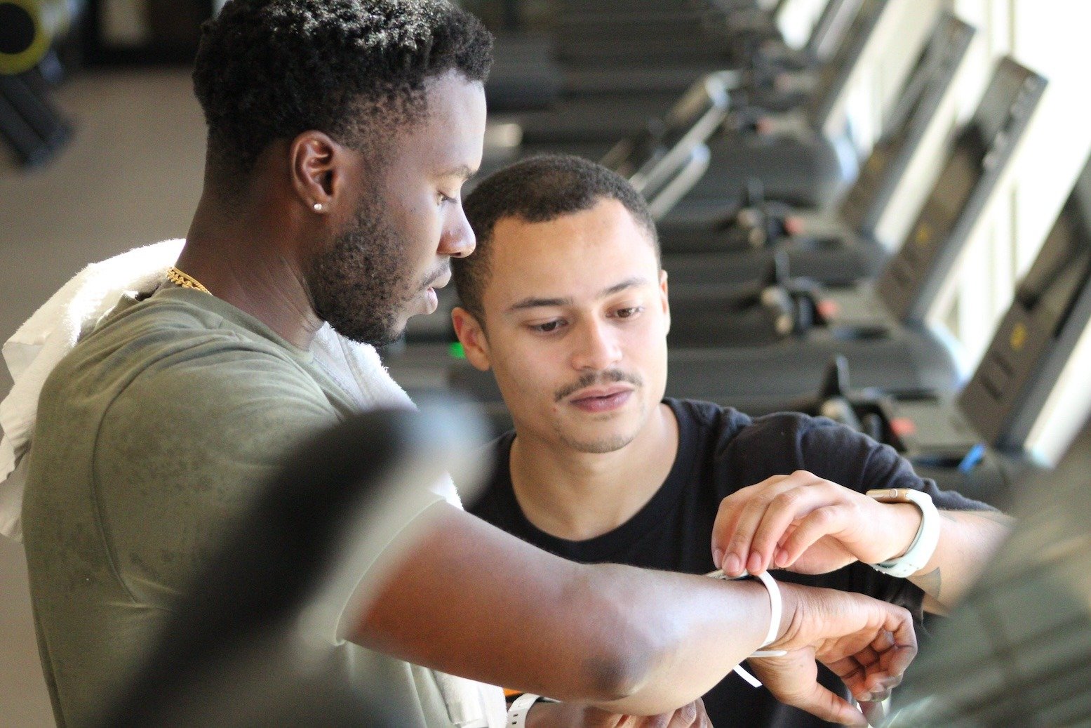
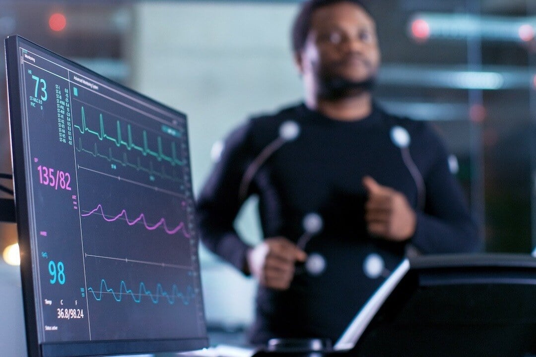
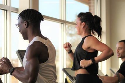
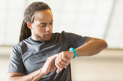
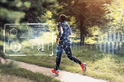
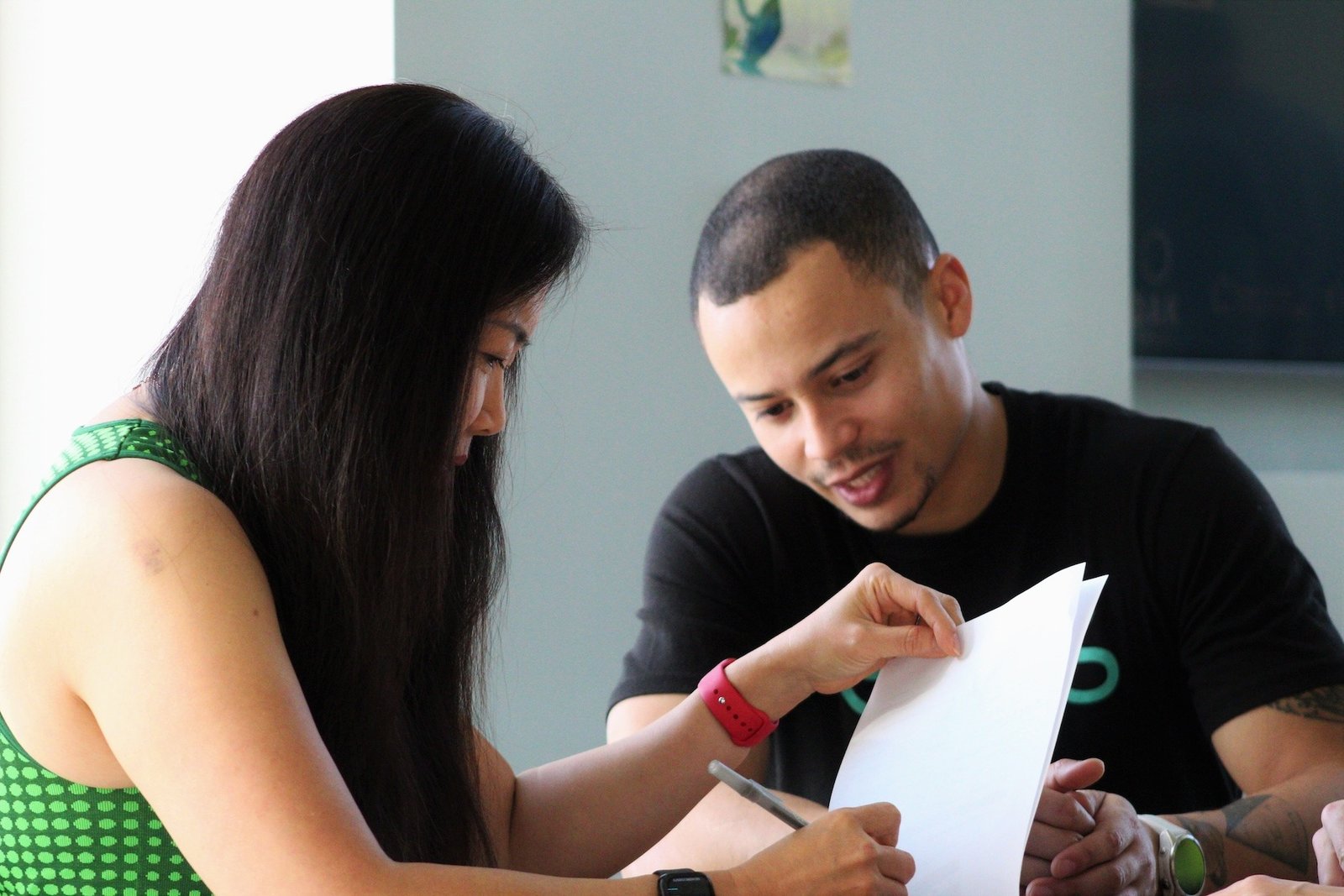
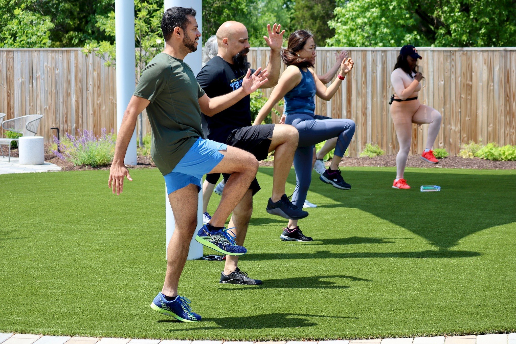
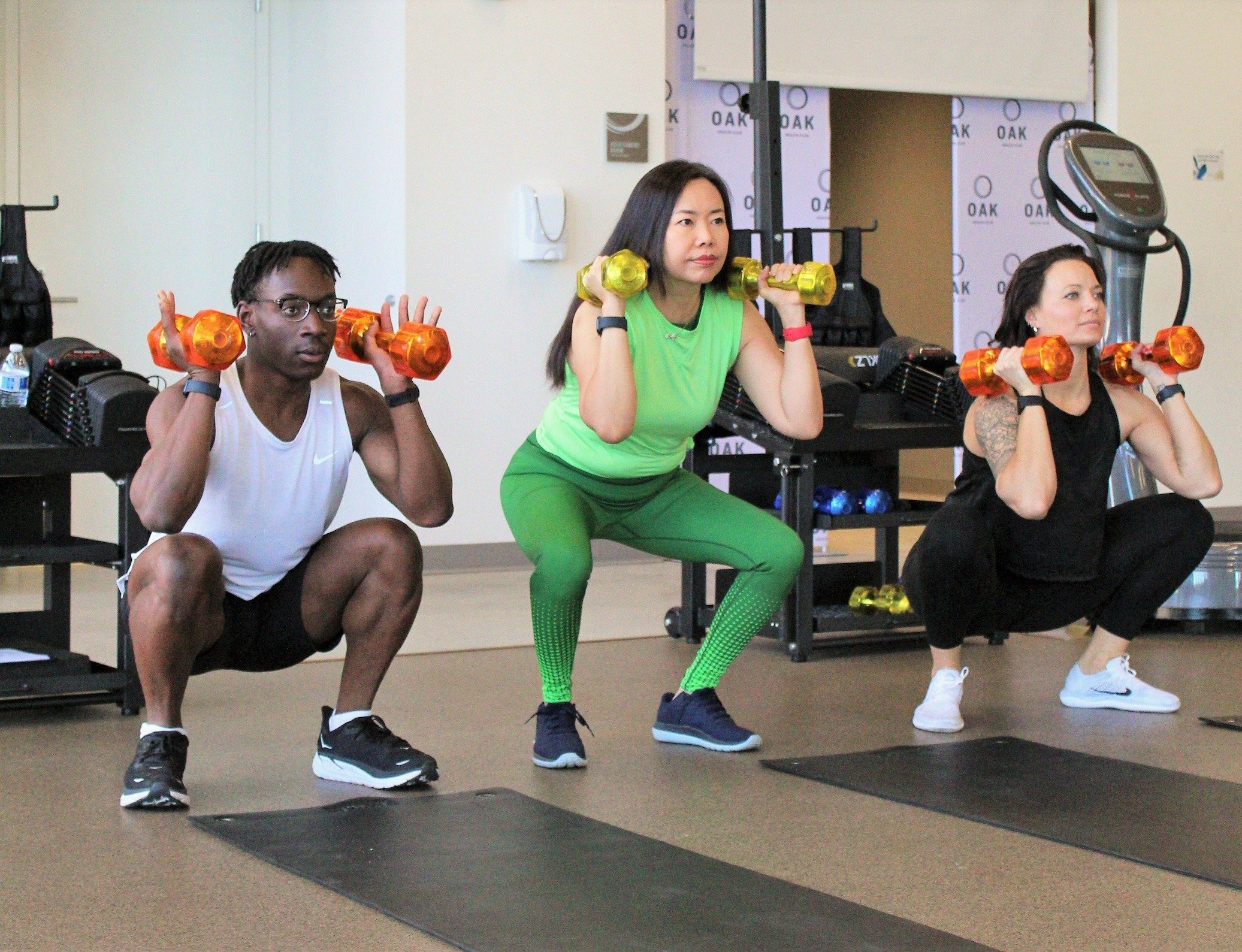
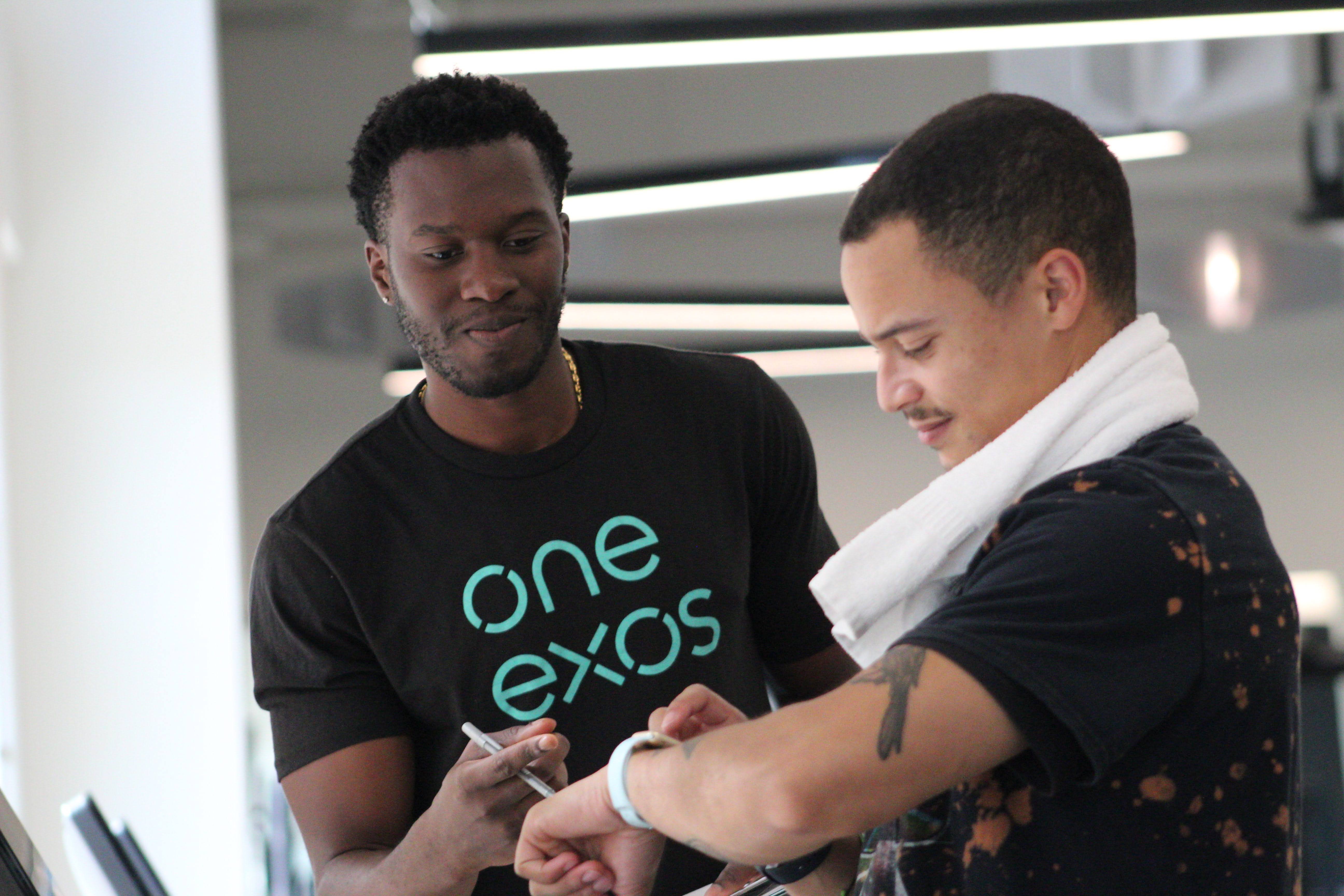
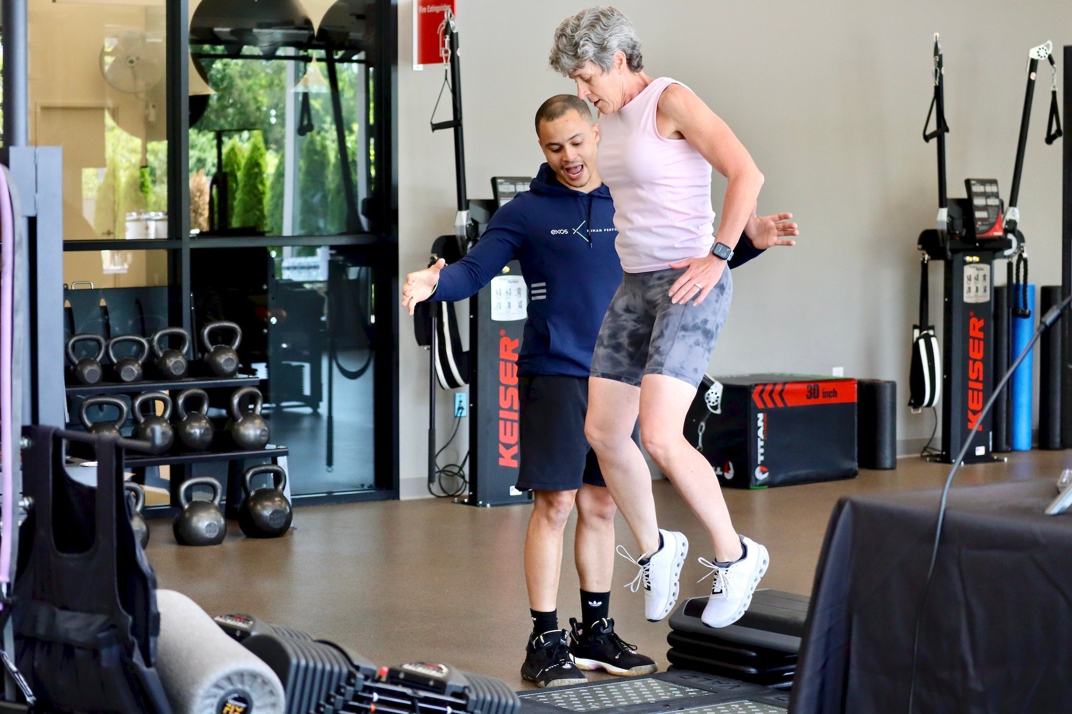
');background-position:right 2em top 50%,0 0;background-repeat:no-repeat;background-size:16px 10px;border:none;font:normal 600 16px/30px Sharp Sans No2;grid-column:span 6;padding:10px 40px 10px 25px}@media screen and (max-width:768px){.courses-template-default .courses__location>select{background-position:right 1em top 50%,0 0;grid-column:span 8}}.courses-template-default .courses__location>select:focus-within{background-image:url('data:image/svg+xml;utf8,')}.courses-template-default .courses__content.grid{gap:32px;grid-template-columns:repeat(auto-fill,minmax(260px,1fr))}@media screen and (max-width:768px){.courses-template-default .courses__content.grid{gap:24px}}.courses-template-default .courses__see-more{color:#9d9d9d;font:normal 600 14px/24px Sharp Sans No2;margin-top:24px;text-align:center;text-decoration:underline}.courses-template-small-carousel .courses-item{border-left:1px solid #9d9d9d;color:var(--color);display:flex;flex-direction:column;height:100%;text-decoration:none}.courses-template-small-carousel .courses-item__title{color:#00dba8;font:normal 600 20px/30px Sharp Sans No2;max-height:120px;min-height:60px;overflow:hidden;padding-left:20px}@media screen and (max-width:768px){.courses-template-small-carousel .courses-item__title{font-size:16px;line-height:26px;min-height:26px;padding-left:10px}}.courses-template-small-carousel .courses-item__cost{font:normal 600 20px/30px Sharp Sans No2;min-height:49px;padding-left:20px}@media screen and (max-width:768px){.courses-template-small-carousel .courses-item__cost{font-size:16px;line-height:26px;min-height:42px;padding-left:10px}}.courses-template-small-carousel .courses-item__description{flex-grow:1;font:normal 600 16px/30px Sharp Sans No2;min-height:172px;overflow:hidden;padding-left:20px}@media screen and (max-width:768px){.courses-template-small-carousel .courses-item__description{font-size:14px;line-height:24px;min-height:203px;padding-left:10px}}.courses-template-small-carousel .courses-item__image{width:100%}.courses-template-small-carousel .courses-item__image img{height:100%;-o-object-fit:cover;object-fit:cover;width:100%}.page-education .courses-template-small-carousel{background:#f2f2f2}.courses-template-small-carousel{overflow:hidden;padding:100px 0}.courses-template-small-carousel .courses__header{margin-bottom:119px}@media screen and (max-width:768px){.courses-template-small-carousel .courses__header{margin-bottom:73px}}.courses-template-small-carousel .courses__title{grid-column:span 9}@media screen and (max-width:768px){.courses-template-small-carousel .courses__title{grid-column:span 6}}.courses-template-small-carousel .courses__button-wrapper{grid-column:span 3}@media screen and (max-width:768px){.courses-template-small-carousel .courses__button-wrapper{grid-column:span 6;margin-top:28px}}.courses-template-small-carousel .courses__button-wrapper .button-block{border-color:var(--color);color:var(--color)}.courses-template-small-carousel .courses__controls{position:relative}.courses-template-small-carousel .courses__control-buttons{bottom:55px;display:flex;gap:20px;position:absolute;right:-15px}.courses-template-small-carousel .courses__btn_prev{-webkit-transform:rotate(180deg);transform:rotate(180deg)}.courses-template-small-carousel .courses__content-wrapper{overflow:hidden;position:relative;width:100%}.courses-template-small-carousel .courses__content-holder{margin-left:-72px;margin-right:-72px}@media screen and (max-width:768px){.courses-template-small-carousel .courses__content-holder{margin:0}}.courses-template-small-carousel .courses__content{display:flex;gap:24px}@media screen and (max-width:768px){.courses-template-small-carousel .courses__content{gap:10px}.courses-template-small-carousel .courses__content.container{margin:0}}.courses-template-small-carousel .courses__item-wrapper{flex-basis:calc(25% - 18px);flex-grow:0;flex-shrink:0;max-height:600px;max-width:calc(25% - 18px)}@media screen and (max-width:768px){.courses-template-small-carousel .courses__item-wrapper{flex-basis:calc(75% - 2.5px);flex-grow:0;flex-shrink:0;max-width:calc(75% - 2.5px)}}.media-library{padding-bottom:117px;padding-top:79px}.page-media-room .media-library__item-footer a{color:#fff;text-decoration:none}.media-library__title{margin-bottom:43px}.media-library__content{grid-gap:24px;display:grid;grid-template-columns:repeat(auto-fit,minmax(280px,1fr))}.media-library__item-image{display:flex}.media-library__item-image img{height:100%;width:100%}.media-library__item-footer{background:#201c52;color:#fff;padding:14px 26px}.media-library__item-footer a{display:flex;flex-direction:row;justify-content:space-between}.media-library__item-footer-icon{height:17px;width:7px}@media screen and (max-width:768px){.media-library__item-image img{width:100%}.media-library__content{flex-direction:column}.media-library__content-item{margin-bottom:20px}.media-library__item-footer{font-size:14px}}.embedded.container{padding:0}.embedded__iframe{border:0;width:100%}@media screen and (max-width:768px){.embedded.container{margin:0}}.default-get-started{background-color:#000;color:#fff;display:flex;padding-top:200px;position:relative}@media screen and (max-width:768px){.default-get-started{padding-left:14px;padding-right:14px}}.default-get-started.container{padding-left:48px;padding-top:175px}@media screen and (max-width:768px){.default-get-started.container{margin:0}}.default-get-started__image-wrapper{bottom:0;left:0;position:absolute;right:0;top:0}.default-get-started .parallax-banner{height:100%!important}.default-get-started__wrapper{display:flex;flex-direction:row;justify-content:space-between;width:100%;z-index:5}@media screen and (max-width:768px){.default-get-started__wrapper{display:block;padding-bottom:50px;padding-left:10px}}.default-get-started__content{border-left:1px solid #00dba8;box-sizing:border-box;display:flex;flex-direction:row;justify-content:space-between;margin-left:-24px;padding-left:24px;width:100%}@media screen and (max-width:768px){.default-get-started__content{align-items:flex-start;flex-direction:column;margin-left:-25px}}.default-get-started__left-side{padding-bottom:180px;width:50%}@media screen and (max-width:768px){.default-get-started__left-side{border-left:0;padding-bottom:32px;width:100%}}.default-get-started__label{color:#00dba8;margin-bottom:46px}@media screen and (max-width:768px){.default-get-started__label{margin-bottom:46px}}.default-get-started__title{margin-bottom:39px}@media screen and (max-width:768px){.default-get-started__title{margin-bottom:69px;width:80%}}.default-get-started__description{width:90%}@media screen and (max-width:768px){.default-get-started__description{width:100%}}.default-get-started__buttons-wrapper{align-items:flex-end;display:flex;flex-direction:column;margin-right:13px;margin-top:64px}@media screen and (max-width:768px){.default-get-started__buttons-wrapper{margin:34px 0 50px}}.default-get-started__buttons-wrapper div{margin:0}.default-get-started__buttons-wrapper .button-block{border:2px solid #fff;color:#fff;width:240px}@media screen and (max-width:768px){.default-get-started__buttons-wrapper .button-block{border:2px solid #fff;color:#fff;width:200px}}.default-get-started__buttons-wrapper .button-block__content{padding:2px 18px 0 25px}.default-get-started__buttons-wrapper .button-block svg{margin-left:0}.default-get-started__buttons-wrapper .button-block:hover{border:2px solid #fff;color:#fff}.default-get-started__button-wrapper:first-child{margin-bottom:26px}@media screen and (max-width:768px){.default-get-started__button-wrapper:first-child{margin-bottom:11px}}.default-get-started__button-wrapper{color:#fff;margin-right:65px;margin-top:2px}.default-get-started .button-block{padding:0 3px}.article{display:flex}.article__wrapper{box-sizing:border-box;margin:0 auto;max-width:1440px;padding-left:72px;padding-right:72px}.article__content{border-left:1px solid #00dba8;margin-bottom:133px;margin-left:-24px;padding-left:20%;padding-right:20%;padding-top:104px}.page-media-article .article__content{margin-bottom:80px}.page-media-article .article__content .offset-left{margin-left:0}@media screen and (max-width:768px){.article__wrapper{padding-left:14px;padding-right:14px}.article__content{margin-left:0;padding-left:2%;padding-right:2%}}.location-list{margin-bottom:0}.location-list__main-title{margin-bottom:35px}.location-list__location-card-filters{margin-top:0}.location-list__filters-title{margin-bottom:35px}.location-list__filters-wrapper{display:flex;flex-direction:row;justify-content:space-between}.location-list__filters-inner{display:grid;grid-template-columns:45% 45%;width:60%}.location-list__filters-item{align-items:center;background-color:#f2f2f2;cursor:pointer;display:flex;flex-direction:row;margin-bottom:20px;margin-right:74px;position:relative}@media screen and (max-width:1480px){.location-list__filters-item{margin-right:24px}}.location-list__filters-item.active{border:1px solid #000;cursor:auto}.location-list__filters-item.active__filters-item-color{border-right:1px solid #000}.location-list__filters-item.active .location-list__filters-item-close-container{align-items:center;display:flex}.location-list__filters-item.active .location-list__filters-item-close-icon{color:#9d9d9d;cursor:pointer;display:flex;height:12px;position:absolute;right:-29px;width:12px}@media screen and (max-width:1480px){.location-list__filters-item.active .location-list__filters-item-close-icon{right:-15px}}.location-list__filters-item-close-icon{display:none}.location-list__filters-item-title{align-items:center;background-color:#f2f2f2;display:flex;font-size:12px;font-weight:700;height:100%;line-height:12px;padding-right:20px;text-transform:uppercase}@media screen and (max-width:1480px){.location-list__filters-item-title{font-size:9px;padding-right:10px}}.location-list__filters-item-color{height:30px;margin-right:20px;min-width:30px}@media screen and (max-width:1480px){.location-list__filters-item-color{margin-right:8px}}.active .location-list__filters-item-color{border-right:1px solid #000}.location-list__button-wrapper .button-block{border:2px solid #000;color:#000}@media screen and (max-width:1480px){.location-list__button-wrapper .button-block{max-width:300px}}.location-list__content{margin-top:110px}.location-list__locations-state-cards{display:grid;grid-template-columns:25% 25% 25% 25%;margin-left:-12px}.location-list__location-card{margin:0 12px 50px}.location-list__location-card>:not(:last-child){margin-bottom:20px}.location-list__location-card-content{height:auto}.location-list__location-card-title{word-wrap:break-word;font-size:28px;font-weight:600;line-height:30px;margin-bottom:15px}.location-list__location-card-address,.location-list__location-card-phone{font-size:16px;font-weight:600;line-height:30px}.location-list__locations-state-title{border-bottom:1px solid #00dba8;color:#00dba8;font-size:20px;font-weight:600;line-height:30px;margin-bottom:63px;padding-bottom:23px;text-transform:uppercase}.location-list__locations-state-wrapper{border-left:none;margin-left:0;padding-left:0}@media screen and (max-width:768px){.location-list{margin-bottom:112px}.location-list__main-title{margin-bottom:48px}.location-list__location-card-filters{margin-top:48px}.location-list__filters-title{margin-bottom:32px}.location-list__filters-wrapper{flex-direction:column}.location-list__filters-inner{display:flex;flex-direction:column;margin-bottom:65px;width:100%}.location-list__filters-item{margin-right:24px;max-width:326px}.location-list__content{margin-top:53px}.location-list__locations-state-cards{display:flex;flex-direction:column;margin-left:0}.location-list__locations-state-wrapper{border-left:1px solid #00dba8;margin-left:-11px;padding-left:12px}.location-list__locations-state-title{border-bottom:none;margin-bottom:48px;padding-bottom:0}.location-list__location-card{margin:0 0 80px}.location-list__location-card-content{height:auto}}.article-list-item{grid-gap:24px;align-items:start;border-top:1px solid #9d9d9d;cursor:pointer;display:grid;grid-template-columns:repeat(12,1fr);padding:40px 0;text-decoration:none}.article-list-item:hover{border-top:1px solid #00dba8}.article-list-item__image{grid-column:span 5;margin-right:40px;max-width:250px;min-width:110px;overflow:hidden;width:100%}.article-list-item__image img{height:100%;-o-object-fit:contain;object-fit:contain;width:100%}@media screen and (max-width:768px){.article-list-item__image{margin-right:20px}}.article-list-item__wrapper{display:flex;flex-direction:column;grid-column:span 7;max-width:340px}.article-list-item__label{color:#00dba8;text-transform:uppercase}.article-list-item__title{color:#fff;margin-top:25px}@media screen and (max-width:768px){.article-list-item__title>div{font-size:4.2vw}}.article-list-item__description-date{color:#9d9d9d;margin-top:25px}.article-list{background-color:#201c52;padding:80px 0}.article-list__title{color:#fff}.article-list__location{grid-gap:24px;margin-top:40px}@media screen and (max-width:768px){.article-list__location.grid{grid-template-columns:repeat(4,1fr)}}.article-list__selection-wrapper{grid-column:span 4;height:58px;position:relative}.article-list__selection-name{color:#9d9d9d;left:26px;pointer-events:none;position:absolute;text-transform:uppercase;top:10px}.article-list__story-type,.article-list__story-year{-webkit-appearance:none;appearance:none;background-color:#fff;background-image:url('data:image/svg+xml;utf8,');background-position:right 2em top 50%,0 0;background-repeat:no-repeat;background-size:16px 10px;border:none;cursor:pointer;font:normal 600 16px/30px Sharp Sans No2;height:100%;outline:0;padding:10px 50px 10px 25px;width:100%}.article-list__story-type:nth-child(2),.article-list__story-year:nth-child(2){padding:20px 40px 0 25px}.article-list__story-type:focus-within,.article-list__story-year:focus-within{background-image:url('data:image/svg+xml;utf8,')}.article-list__story-text{-webkit-appearance:none;appearance:none;background-position:right 2em top 50%,0 0;background-repeat:no-repeat;background-size:16px 10px;border:none;box-sizing:border-box;cursor:pointer;cursor:default;font:normal 600 16px/30px Sharp Sans No2;height:100%;outline:0;padding:10px 16% 10px 25px;width:100%}.article-list__story-text:nth-child(2){padding:20px 40px 0 25px}.article-list__story-search{background-color:#fff;background-image:url('data:image/svg+xml;utf8,');background-position:50%;background-repeat:no-repeat;background-size:50%;border:none;cursor:pointer;height:100%;position:absolute;right:0;top:0;width:15%;z-index:1}@media screen and (max-width:768px){.article-list__story-search{background-size:20px;padding:0 38px;width:20px}}.article-list__content{grid-gap:24px;display:grid;grid-template-columns:repeat(8,1fr);margin-top:100px}.article-list__content>*{grid-column:span 4}@media screen and (max-width:768px){.article-list__content{grid-template-columns:repeat(4,1fr)}}.article-list__article-button{cursor:pointer;text-decoration:underline}.article-list__article-button,.article-list__no-news-msg{color:#9d9d9d;display:flex;justify-content:center}.blog-list-item{grid-gap:24px;align-items:start;border-top:1px solid #9d9d9d;cursor:pointer;display:grid;grid-column:span 4;grid-template-columns:repeat(12,1fr);padding:40px 0;text-decoration:none}.blog-list-item:hover{border-top:1px solid #00dba8}.blog-list-item:hover .blog-list-item__title{text-decoration:underline}.blog-list-item:hover .blog-list-item__image{-webkit-filter:grayscale(5%);filter:grayscale(5%)}.blog-list-item__image{-webkit-filter:grayscale(100%);filter:grayscale(100%);grid-column:span 5;height:100%;position:relative;width:100%}.blog-list-item__image-wrapper{bottom:0;left:0;position:absolute;right:0;top:0}.blog-list-item__image-wrapper img{height:auto!important;width:100%!important}.blog-list-item .parallax-banner{height:100%!important}.blog-list-item__wrapper{display:flex;flex-direction:column;grid-column:span 7;max-width:340px}.blog-list-item__label{color:#00dba8;text-transform:uppercase}.blog-list-item__title{color:#fff;margin-top:25px}.blog-list-item__title div{font-weight:400}.blog-list-item__description-date{color:#9d9d9d;margin-top:25px}@media screen and (max-width:768px){.blog-list-item__image{height:125px;width:125px}.blog-list-item__title>div{font-size:4.2vw}}.blog-list-item-new{align-items:center;border-bottom:1px solid hsla(0,0%,100%,.4);display:flex;font-weight:400;padding-bottom:36px;padding-top:33px;text-transform:uppercase}.blog-list-item-new:hover .blog-list-item-new__item-arrow-icon{opacity:1;transition:opacity .5s ease-in}.blog-list-item-new:hover .blog-list-item-new__item-image{opacity:.4;transition:opacity .5s ease-in}.blog-list-item-new__item-title{cursor:pointer;width:100%;z-index:15}.blog-list-item-new__item-image{bottom:100px;opacity:0;pointer-events:none;position:absolute;right:0;top:250px;transition:opacity .5s ease-in;width:745px;z-index:5}.blog-list-item-new__item-link{align-items:center;color:#fff;display:flex;text-decoration:none}.blog-list-item-new__item-link:hover{color:#00dba8;transition:color .5s ease-in}@media screen and (max-width:768px){.blog-list-item-new__item-image{display:none}}.blog-post-list{background-color:#201c52;padding:125px 0 100px;position:relative}.page-home .blog-post-list,.page-landing-employer .blog-post-list{background-color:#000}.page-home .blog-post-list__title,.page-landing-employer .blog-post-list__title{color:#fff}.blog-post-list__title{font-size:40px;font-weight:500;line-height:40px;text-transform:uppercase}.blog-post-list__content{grid-gap:24px;display:grid;grid-template-columns:repeat(8,1fr);margin-top:100px}.blog-post-list__items-container{border-top:1px solid #9d9d9d;margin-top:87px}.blog-post-list__more-link{color:#9d9d9d;cursor:pointer;display:flex;justify-content:center;margin-top:100px;text-decoration:underline}@media screen and (max-width:768px){.blog-post-list__content{grid-template-columns:repeat(4,1fr)}}.case-study-get-started{background:#fff;color:#000;padding:175px 0 0}@media screen and (max-width:768px){.case-study-get-started{margin-left:0!important;padding:100px 0 30px!important}}.case-study-get-started__content{border-left:1px solid #00dba8;padding-left:24px}@media screen and (max-width:768px){.case-study-get-started__content{border-left:10px solid #00dba8;padding-left:9px}}.case-study-get-started__label{color:#00dba8;margin-bottom:37px}@media screen and (max-width:768px){.case-study-get-started__label{margin-bottom:31px}}.case-study-get-started__title{color:#201c52;margin-bottom:30px}@media screen and (max-width:768px){.case-study-get-started__title{margin-bottom:25px}}.case-study-get-started__button{margin-top:40px}.case-study-get-started__button button{background:#00dba8;border:none;color:#000}.case-study-get-started__button button:hover{border:none;color:#fff}.gated-get-started{background-color:#fff;color:#201c52;display:flex;padding-top:200px;position:relative}.gated-get-started__left-side{padding-bottom:180px;width:90%}@media screen and (max-width:768px){.gated-get-started__left-side{border-left:10px solid #55debc;margin-left:-38px;padding-bottom:0;padding-left:24px;width:100%}}.gated-get-started__description{opacity:.6;width:90%}@media screen and (max-width:768px){.gated-get-started__wrapper{display:block;margin-left:14px;margin-right:14px;padding-bottom:50px;padding-left:10px}}.gated-get-started__content{border-left:1px solid #00dba8;box-sizing:border-box;display:flex;flex-direction:row;justify-content:space-between;margin-left:-24px;padding-left:24px;width:100%}@media screen and (max-width:768px){.gated-get-started__content{align-items:flex-start;border-left:none;flex-direction:column;margin-left:0}}.gated-get-started.container{padding-left:48px;padding-top:175px}@media screen and (max-width:768px){.gated-get-started.container{margin:0}}.gated-get-started__image-wrapper{min-width:350px;width:55%}.gated-get-started__image-wrapper img{height:auto!important}.gated-get-started__wrapper{display:flex;flex-direction:row;justify-content:space-between;width:100%;z-index:5}.gated-get-started__label{color:#00dba8;margin-bottom:46px}.gated-get-started__title{margin-bottom:39px}@media screen and (max-width:768px){.gated-get-started__title{margin-bottom:69px;width:80%}}.education-get-started{background:#fff;color:#000;display:flex;position:relative}.page-blog .education-get-started{background-color:#000;color:inherit;padding-top:200px;position:relative}.page-blog .education-get-started__left-side{width:90%}@media screen and (max-width:768px){.page-blog .education-get-started__left-side{border-left:10px solid #55debc;margin-left:-38px;padding-bottom:0;padding-left:24px;width:100%}}.page-blog .education-get-started__description{opacity:.6}@media screen and (max-width:768px){.page-blog .education-get-started__wrapper{margin-left:14px;margin-right:14px}}.page-blog .education-get-started__content{margin-left:-24px}@media screen and (max-width:768px){.page-blog .education-get-started__content{border-left:none;margin-left:0}.page-media-article .education-get-started__left-side{width:100%}}.education-get-started.container{padding-left:48px;padding-top:175px}@media screen and (max-width:768px){.education-get-started.container{margin:0}}.education-get-started__image-wrapper{bottom:0;left:0;position:absolute;right:0;top:0}.education-get-started .parallax-banner{height:100%!important}.education-get-started__wrapper{display:flex;flex-direction:row;justify-content:space-between;width:100%;z-index:5}@media screen and (max-width:768px){.education-get-started__wrapper{display:block;padding-bottom:50px;padding-left:10px}}.education-get-started__content{border-left:1px solid #00dba8;box-sizing:border-box;display:flex;flex-direction:row;justify-content:space-between;padding-left:24px;width:100%}@media screen and (max-width:768px){.education-get-started__content{align-items:flex-start;flex-direction:column}}.education-get-started__left-side{padding-bottom:180px;width:45%}@media screen and (max-width:768px){.education-get-started__left-side{border-left:0;padding-bottom:32px;width:85%}}.education-get-started__label{color:#00dba8;margin-bottom:46px}@media screen and (max-width:768px){.education-get-started__label{margin-bottom:46px}}.education-get-started__title{margin-bottom:39px}@media screen and (max-width:768px){.education-get-started__title{margin-bottom:69px;width:80%}}.education-get-started__description{width:90%}@media screen and (max-width:768px){.education-get-started__description{width:100%}}.education-get-started__buttons-wrapper{align-items:flex-end;display:flex;flex-direction:column;margin-right:13px;margin-top:64px}.education-get-started__buttons-wrapper div{margin:0}.education-get-started__buttons-wrapper .button-block{border:2px solid #000;color:#000;width:240px}.education-get-started__buttons-wrapper .button-block__content{padding:2px 18px 0 25px}.education-get-started__buttons-wrapper .button-block svg{margin-left:0}.education-get-started__buttons-wrapper .button-block:hover{border:2px solid #fff;color:#fff}@media screen and (max-width:768px){.education-get-started__buttons-wrapper{margin:34px 0 50px}.education-get-started__buttons-wrapper .button-block{width:200px}.education-get-started__buttons-wrapper .button-block svg{margin-left:0}}.education-get-started__button-wrapper:first-child{margin-bottom:26px}@media screen and (max-width:768px){.education-get-started__button-wrapper:first-child{margin-bottom:11px}}.education-get-started__button-wrapper{color:#fff;margin-right:65px;margin-top:2px}.education-get-started .button-block{padding:0 3px}.page-blog-caseStudy{--bg-color:#fff}.post{background-color:#fff;color:#000;display:flex;justify-content:center;overflow:hidden}@media screen and (max-width:768px){.post{overflow:visible}}.post__wrapper{box-sizing:border-box;display:flex;flex-direction:column;margin-top:104px;position:relative;width:100%;z-index:1}.post__hide-header{margin-top:240px!important}.post__border-left-block{border-left:1px solid #00dba8;margin:-104px auto 0 calc(50% - 672px);min-height:120%;min-width:1440px;position:absolute;width:1440px;z-index:-1}@media screen and (max-width:1455px){.post__border-left-block{left:0;margin:-104px 0 0 48px;min-width:auto;width:auto}}@media screen and (max-width:768px){.post__border-left-block{display:none}}.post__content a{color:#000;position:relative;z-index:1}.post__content:last-child{margin-bottom:100px}.post__content-post{margin-left:-24px;max-width:1440px;padding-left:calc(33% - 72px);padding-right:calc(33% - 72px)}.post__content-component{width:100%}.post__content-hubSpotForm{padding:0 16%}.post__button{margin-top:70px}.post__button .button-block{background:#00dba8;border:2px solid #00dba8;color:#000}.post__button .button-block:hover{background:#fff;transition:color,background-color 1s}@media screen and (max-width:768px){.post__wrapper{margin-top:40px;padding-left:14px;padding-right:14px}.page-blog-caseStudy .post__wrapper{padding-left:0;padding-right:0}.post__content{border-left:none;margin-left:0;padding-left:2%;padding-right:2%;padding-top:5px}.post__content:last-child{margin-bottom:40px}}.one-pdf-download{grid-gap:20px;display:grid;grid-template-columns:repeat(12,1fr);margin-bottom:25px;margin-top:30px;text-align:justify}.one-pdf-download__image{grid-area:1/1/1/7;position:relative}.one-pdf-download__modal-content iframe{min-height:80vh;min-width:100%}.one-pdf-download__file-info{background:rgba(0,0,0,.5);border-top:1px solid #9d9d9d;bottom:0;box-sizing:border-box;color:#fff;display:flex;flex-direction:column;min-height:15%;padding:3%;position:absolute;width:100%}.one-pdf-download div div{font-weight:700}.one-pdf-download__title{margin-bottom:30px;margin-left:40px}@media screen and (max-width:768px){.one-pdf-download__title{margin-bottom:25px;margin-left:0}}.one-pdf-download__info-block{color:#9d9d9d;grid-area:1/7/1/13}.one-pdf-download__info-block p{margin:0}.one-pdf-download__button-wrapper{margin-left:40px}.one-pdf-download__button-wrapper button{border-color:#000;color:#000;position:relative;z-index:1}.one-pdf-download__button-wrapper button .button-block__content{font-weight:600;padding:0 15px}.one-pdf-download__button-wrapper button .button-block__content div{margin-right:0!important}@media screen and (max-width:768px){.one-pdf-download__button-wrapper{margin-left:0}.one-pdf-download__image{grid-area:1/1/1/13}.one-pdf-download__info-block{grid-area:2/1/2/13}}.multiple-pdf-download{background:#f2f2f2;margin-left:-24px;max-width:1440px;padding-left:calc(33% - 72px);padding-right:calc(33% - 72px)}.multiple-pdf-download__wrapper{display:grid;grid-template-columns:repeat(12,1fr);margin:35px 0;max-width:640px;padding:60px 0;text-align:justify}.multiple-pdf-download__image{grid-area:1/1/1/13;margin-bottom:15px;max-height:43px}.multiple-pdf-download__image .adaptive-image{width:auto!important}.multiple-pdf-download__info-block{grid-area:2/1/2/13}.multiple-pdf-download__info-block p{margin:0}.multiple-pdf-download__button-wrapper button{border-color:#000;color:#000;position:relative;z-index:1}.multiple-pdf-download__button-wrapper button .button-block__content{font-weight:600;padding:0 15px}.multiple-pdf-download__button-wrapper button .button-block__content div{margin-right:0!important}@media screen and (max-width:768px){.multiple-pdf-download__image{grid-area:1/1/1/13}.multiple-pdf-download__info-block{grid-area:2/1/2/13}}.feature-item-extended{align-items:center;display:grid;grid-template-columns:repeat(12,1fr)}@media screen and (max-width:768px){.feature-item-extended{display:flex;flex-direction:column}}.feature-item-extended_right{margin-left:68px}@media screen and (max-width:768px){.feature-item-extended_right{margin-left:0}}.feature-item-extended__image_left{grid-area:1/1/1/4}.feature-item-extended__image_left img{width:110%!important}.feature-item-extended__image_right{grid-area:1/9/1/12;margin-left:-19px;position:relative;z-index:1}.feature-item-extended__image_right img{width:95%!important}.feature-item-extended__image img{height:auto!important;max-width:264px}@media screen and (max-width:768px){.feature-item-extended__image img{max-width:150px}}.feature-item-extended__content{display:flex;flex-direction:column;justify-content:center}.feature-item-extended__content_left{grid-area:1/6/1/13}.feature-item-extended__content_right{grid-area:1/1/1/7}@media screen and (max-width:768px){.feature-item-extended__content{text-align:center}}.feature-item-extended__title{margin-bottom:23px;margin-top:39px}@media screen and (max-width:768px){.feature-item-extended__title{margin-bottom:15px;margin-top:5px;max-width:95%}}.feature-item-extended:not(:last-child){margin-bottom:70px}@media screen and (max-width:1250px){.feature-item-extended:not(:last-child){margin-bottom:20px}}@media screen and (max-width:768px){.feature-item-extended:not(:last-child){margin-bottom:35px}}.landing-fit-right-app-experience{margin-top:120px!important;padding-left:0!important;padding-right:0!important}@media screen and (max-width:768px){.landing-fit-right-app-experience{margin-top:30px!important}}.landing-fit-right-app-experience__title-desktop{margin-bottom:135px;margin-left:68px;max-width:40%}.landing-fit-right-app-experience__title-desktop p{margin:0}@media screen and (max-width:1150px){.landing-fit-right-app-experience__title-desktop{margin-bottom:50px}}@media screen and (max-width:950px){.landing-fit-right-app-experience__title-desktop{margin-bottom:10px}}.landing-fit-right-app-experience__content{display:flex;flex-wrap:nowrap}@media screen and (max-width:768px){.landing-fit-right-app-experience__content{flex-direction:column}}.landing-fit-right-app-experience__content-image{max-width:56%;width:60%}@media screen and (min-width:769px){.landing-fit-right-app-experience__content-image .parallax-banner{height:800px!important;width:100%!important}}.landing-fit-right-app-experience__content-image img{height:auto!important;width:100%!important}@media screen and (max-width:768px){.landing-fit-right-app-experience__content-image{max-width:100%;width:100%}.landing-fit-right-app-experience__content-image img{width:calc(100% + 24px)!important}}.landing-fit-right-app-experience__content-info{margin-right:-11.5%;margin-top:70px;width:55%}@media screen and (max-width:1250px){.landing-fit-right-app-experience__content-info{margin-top:20px}}@media screen and (max-width:768px){.landing-fit-right-app-experience__content-info{margin-right:0;margin-top:-60px;width:100%}}.landing-fit-left-app-experience{padding-left:0!important;padding-right:0!important}.landing-fit-left-app-experience__title{margin:120px 0 50px 67px;max-width:45%}.landing-fit-left-app-experience__title p{margin:0}@media screen and (max-width:768px){.landing-fit-left-app-experience__title{margin:60px 0 32px;max-width:90%}}.landing-fit-left-app-experience__content{display:flex;flex-wrap:nowrap;position:relative}@media screen and (max-width:768px){.landing-fit-left-app-experience__content{align-items:center;flex-direction:column;padding-bottom:20px}}.landing-fit-left-app-experience__content-image{max-width:56%;width:56%}@media screen and (min-width:769px){.landing-fit-left-app-experience__content-image .parallax-banner{height:800px!important;width:calc(100% + 24px)!important}}.landing-fit-left-app-experience__content-image img{height:auto!important;width:calc(100% + 24px)!important}@media screen and (max-width:768px){.landing-fit-left-app-experience__content-image{max-width:100%;width:100%}}.landing-fit-left-app-experience__content-info{margin-left:-5%;margin-top:10px;width:48%;z-index:1}@media screen and (max-width:1250px){.landing-fit-left-app-experience__content-info{margin-top:20px}}@media screen and (max-width:768px){.landing-fit-left-app-experience__content-info{margin-left:0;margin-top:-90px;width:100%}}.case-study__frame-image img{display:block}.case-study__frame-image img,.case-study__frame-image video{height:auto;max-width:100%;width:100%}@media screen and (max-width:768px){.case-study__frame-image{margin:0!important}}.case-study__frame-block{margin-bottom:52px}@media screen and (max-width:768px){.case-study__frame-block{margin-bottom:-3px}}.case-study__button-block{background:#201c52;padding:80px 0 38px}@media screen and (max-width:768px){.case-study__button-block{display:flex;justify-content:center;padding:60px 0 0}}.case-study__button-block button{background:#00dba8;border:none;color:#000}.case-study__button-block button:hover{border:none;color:#fff}.case-study__bottom-text{background:#201c52;color:#fff}@media screen and (max-width:768px){.case-study__bottom-text{margin:-1px 0;padding:30px 0 0}}.case-study__bottom-text p{display:inline-block;margin:0 5px 0 0}.countdown{display:flex;justify-content:space-between;width:100%}.countdown__item-value{color:#00dba8;margin-bottom:10px!important}.countdown__item{align-items:center;display:flex;flex-direction:column}.countdown__item:not(:last-child){margin-right:15px}.hero-item-countdown{position:relative}.hero-item-countdown__image-wrapper{bottom:0;left:0;position:absolute;right:0;top:0}.hero-item-countdown__wrapper{grid-row-gap:0;display:grid;gap:24px;grid-template-columns:6fr 4.5fr;height:990px}.hero-item-countdown__wrapper.container{padding:0}.hero-item-countdown__left-wrapper{z-index:5}.hero-item-countdown__left-wrapper,.hero-item-countdown__title{display:flex;flex-direction:column;justify-content:space-between}.hero-item-countdown__title{margin:340px 0 0 48px;padding-left:24px}.hero-item-countdown__title div{font-weight:800}.hero-item-countdown__title div:not(:last-child){color:#00dba8}.hero-item-countdown__right-wrapper{display:flex;flex-direction:column;margin-top:350px;z-index:5}.hero-item-countdown__right-wrapper>div{max-width:70%}.hero-item-countdown__subtitle div{font-weight:700}.hero-item-countdown__countdown,.hero-item-countdown__description{margin-top:30px}.hero-item-countdown__button{align-self:self-start;margin-top:55px;z-index:5}.hero-item-countdown__button .button-block{border-color:#00dba8;color:#00dba8}.hero-item-countdown__button .button-block:hover{color:#000}.hero-item-countdown__button .button-block__content{padding:0 15px}.hero-item-countdown__button .button-block__content div{margin-right:0!important}.hero-item-countdown__button .button-block__content svg{margin-left:35px}@media screen and (max-width:768px){.hero-item-countdown__wrapper{display:flex;flex-direction:column;height:770px}.hero-item-countdown__wrapper.container{margin:0}.hero-item-countdown__left-wrapper{display:block}.hero-item-countdown__title{margin:141px 0 0 14px;padding-left:10px}.hero-item-countdown__title div{line-height:55px}.hero-item-countdown__right-wrapper{margin-left:25px;margin-top:15px;z-index:5}.hero-item-countdown__countdown{margin-top:86px;max-width:375px!important;width:95%!important}.hero-item-countdown__description{margin-top:19px;max-width:100%!important}.hero-item-countdown__button{margin-top:25px}.hero-item-countdown__button .button-block{min-height:59px}.hero-item-countdown__button .button-block__content div{margin-right:20px!important}.hero-item-countdown__button .button-block__content svg{width:20px}}.image-link-with-css-text-item{align-items:center;display:flex;justify-content:center;padding-top:65px;position:relative}.tgc-team{background-color:#201c52}.page-thegamechanger .tgc-team__title{width:90%}.page-thegamechanger .tgc-team__container{padding-bottom:45px}@media screen and (max-width:768px){.page-thegamechanger .tgc-team__container{padding:0}.page-thegamechanger .tgc-team__title{margin-bottom:30px}.page-thegamechanger .tgc-team__items{gap:25px}}.tgc-team__container{padding:70px 50px 120px 0}.tgc-team__title{margin-bottom:65px;width:60%}.tgc-team__image-wrapper{border-radius:50%;height:108px;min-width:108px;overflow:hidden;width:108px}.tgc-team__image-wrapper img{height:100%;-o-object-fit:cover;object-fit:cover;width:100%}.tgc-team__items{display:grid;gap:40px;grid-template-columns:repeat(3,1fr);grid-template-rows:repeat(2,1fr)}.tgc-team__item{align-items:center;display:flex}.tgc-team__text{padding-left:15px}@media screen and (max-width:1480px){.tgc-team__items{gap:20px;grid-template-columns:repeat(2,1fr)}}@media screen and (max-width:768px){.tgc-team{padding:30px 0}.tgc-team__title{width:100%}.tgc-team__items{gap:20px;grid-template-columns:repeat(1,1fr)}.tgc-team__image-wrapper{height:60px;min-width:60px;width:60px}}.sticky-form{align-items:center;background:#000;display:flex;justify-content:center;padding:17px 0;position:fixed;width:100%;z-index:60}.sticky-form__button{font-size:20px}.sticky-form__button button{background:0 0;border:2px solid #00dba8;color:#fff}.sticky-form__button .button-block svg{margin-left:0}@media screen and (max-width:768px){.sticky-form__button .button-block div{margin-right:6px!important;padding:0 3px}}.stats-table{margin-top:65px}.stats-table__description{margin-top:10px}.stats-table__table{display:grid;gap:3px;grid-template-columns:repeat(3,2fr);margin-top:25px}@media screen and (max-width:768px){.stats-table__table{gap:2px;grid-template-columns:repeat(1,2fr)}}.stats-table__cell{padding:20px}.stats-table__cell_border{border:1px solid #000}@font-face{font-display:swap;font-family:Sharp Sans No2;font-style:normal;font-weight:400;src:url(/static/SharpSansDispNo2-Book-f45defbf66d1bb5dc06d8303ffd43896.woff2) format("woff2")}@font-face{font-display:swap;font-family:Sharp Sans No2;font-style:italic;font-weight:400;src:url(/static/SharpSansDispNo2-BookObl-a37fe7be7ae5222f7043f1a70bd89426.woff2) format("woff2")}@font-face{font-display:swap;font-family:Sharp Sans No2;font-style:normal;font-weight:500;src:url(/static/SharpSansDispNo2-Medium-cf7c6656f2083a9511d68e17190381a4.woff2) format("woff2")}@font-face{font-display:swap;font-family:Sharp Sans No2;font-style:italic;font-weight:500;src:url(/static/SharpSansDispNo2-MediumObl-2f52e1d4b3b4ec13931e65c644337afd.woff2) format("woff2")}@font-face{font-display:swap;font-family:Sharp Sans No2;font-style:normal;font-weight:600;src:url(/static/SharpSansDispNo2-Semibold-6007cdf29ed16dda499b03a0690ac79b.woff2) format("woff2")}@font-face{font-display:swap;font-family:Sharp Sans No2;font-style:italic;font-weight:600;src:url(/static/SharpSansDispNo2-SemiboldObl-6744d0b5a31facb48a269c6526f46f6b.woff2) format("woff2")}@font-face{font-display:swap;font-family:Sharp Sans No2;font-style:normal;font-weight:700;src:url(/static/SharpSansDispNo2-Bold-dd8ee21e056b289abc35890430035819.woff2) format("woff2")}@font-face{font-display:swap;font-family:Sharp Sans No2;font-style:italic;font-weight:700;src:url(/static/SharpSansDispNo2-BoldObl-cad54e29be854b28c5bbb2297a44f536.woff2) format("woff2")}@font-face{font-display:swap;font-family:Reader Pro;font-style:normal;font-weight:400;src:url(/static/reader-regular-48c187bc3d90fcacf41fe4d00cfbfa7f.woff2) format("woff2")}@font-face{font-display:swap;font-family:Reader Pro;font-style:italic;font-weight:400;src:url(/static/reader-regular-italic-24df6cee78cb088ad73a1cd1961af9f7.woff2) format("woff2")}@font-face{font-display:swap;font-family:Reader Pro;font-style:normal;font-weight:500;src:url(/static/reader-medium-edf2f12989ce4dad05906ecbe5e22963.woff2) format("woff2")}@font-face{font-display:swap;font-family:Reader Pro;font-style:italic;font-weight:500;src:url(/static/reader-medium-italic-14428268ea298d90429367cb0fcb2784.woff2) format("woff2")}@font-face{font-display:swap;font-family:Reader Pro;font-style:normal;font-weight:700;src:url(/static/reader-bold-5c2ada6233b3ac2d871ee82f577f097f.woff2) format("woff2")}@font-face{font-display:swap;font-family:Reader Pro;font-style:italic;font-weight:700;src:url(/static/reader-bold-italic-28b47abc9a2101368dd210d25cd454b0.woff2) format("woff2")}@media screen and (max-width:1480px){html{font-size:1.4vw}}.typos-article,.typos-display1,.typos-display2,.typos-display3,.typos-headline,.typos-name,.typos-overline,.typos-subheader1,.typos-subheader2,.typos-title,h1,h2,h3,h4,h5{font-family:Sharp Sans No2;letter-spacing:0;margin:0}.typos-body1,.typos-body2,.typos-body3{font-family:Reader Pro;letter-spacing:0;margin:0}.typos-display3{font-size:130px;font-weight:400;line-height:1.0769230769}.typos-display3_color-aquamarine{color:#00dba8}.typos-display3_caps{text-transform:uppercase}@media screen and (max-width:1480px){.typos-display3{font-size:6.5rem}}@media screen and (max-width:768px){.typos-display3{font-size:70px;font-weight:500;line-height:60px}}.typos-display2{font-size:110px;font-weight:400;line-height:1.0909090909;text-transform:uppercase}.typos-display2_color-aquamarine{color:#00dba8}.typos-display2_caps{text-transform:uppercase}@media screen and (max-width:1480px){.typos-display2{font-size:5.5rem}}@media screen and (max-width:768px){.typos-display2{font-size:60px;line-height:70px}}.typos-display1{font-size:90px;font-weight:500;line-height:80px;text-transform:uppercase}.typos-display1_color-aquamarine{color:#00dba8}.typos-display1_caps{text-transform:uppercase}@media screen and (max-width:1480px){.typos-display1{font-size:4.5rem}}@media screen and (max-width:768px){.typos-display1{font-size:35px;line-height:35px}}.typos-title,h1{font-size:60px;font-weight:700;line-height:60px;text-transform:uppercase}.typos-title_color-aquamarine,h1_color-aquamarine{color:#00dba8}.typos-title_caps,h1_caps{text-transform:uppercase}@media screen and (max-width:1480px){.typos-title,h1{font-size:3rem}}@media screen and (max-width:768px){.typos-title,h1{font-size:40px;line-height:40px}}.typos-headline,h2{font-size:50px;font-weight:500;line-height:60px;text-transform:uppercase}.typos-headline_color-aquamarine,h2_color-aquamarine{color:#00dba8}.typos-headline_caps,h2_caps{text-transform:uppercase}@media screen and (max-width:1480px){.typos-headline,h2{font-size:2.5rem}}@media screen and (max-width:768px){.typos-headline,h2{font-size:40px;line-height:40px}}.typos-subheader1,h3{font-size:40px;font-weight:500;line-height:40px}.typos-subheader1_color-aquamarine,h3_color-aquamarine{color:#00dba8}.typos-subheader1_caps,h3_caps{text-transform:uppercase}@media screen and (max-width:1480px){.typos-subheader1,h3{font-size:2rem}}@media screen and (max-width:768px){.typos-subheader1,h3{font-size:30px;line-height:30px}}.typos-subheader2,h4{font-size:30px;font-weight:500;line-height:40px}.typos-subheader2_color-aquamarine,h4_color-aquamarine{color:#00dba8}.typos-subheader2_caps,h4_caps{text-transform:uppercase}@media screen and (max-width:1480px){.typos-subheader2,h4{font-size:1.5rem}}@media screen and (max-width:768px){.typos-subheader2,h4{font-size:20px;line-height:30px}}h5{font-size:28px;font-weight:700;line-height:40px}h5_color-aquamarine{color:#00dba8}h5_caps{text-transform:uppercase}@media screen and (max-width:1480px){h5{font-size:1.4rem}}@media screen and (max-width:768px){h5{font-size:18px;line-height:30px}}.typos-body1{font-size:20px;font-weight:400;line-height:30px}.typos-body1_color-aquamarine{color:#00dba8}.typos-body1_caps{text-transform:uppercase}@media screen and (max-width:768px){.typos-body1{font-size:16px;line-height:26px}}.typos-body2{font-size:20px;font-weight:400;line-height:30px}.typos-body2_color-aquamarine{color:#00dba8}.typos-body2_caps{text-transform:uppercase}@media screen and (max-width:768px){.typos-body2{font-size:16px;line-height:26px}}.typos-body3{font-size:16px;font-weight:400;line-height:22px}.typos-body3_color-aquamarine{color:#00dba8}.typos-body3_caps{text-transform:uppercase}@media screen and (max-width:768px){.typos-body3{font-size:14px;line-height:20px}}.typos-article{font-size:10px;font-weight:700;line-height:14px}.typos-article_color-aquamarine{color:#00dba8}.typos-article_caps{text-transform:uppercase}.typos-overline{font-size:14px;font-weight:700;line-height:14px}.typos-overline_color-aquamarine{color:#00dba8}.typos-overline_caps{text-transform:uppercase}.typos-name{font-size:16px;font-weight:700;line-height:30px}.typos-name_color-aquamarine{color:#00dba8}.typos-name_caps{text-transform:uppercase}@media screen and (max-width:768px){.typos-name{font-size:14px;font-weight:600;line-height:24px}}.typos-inherit{font-size:inherit;font-weight:inherit;line-height:inherit}.offset-left{margin-left:30px}@media screen and (max-width:768px){.offset-left{margin-left:20px}}html.frozen,html.frozen body{height:100%;overflow:hidden}body,html{font-family:Sharp Sans No2;margin:0;padding:0}body{--bg-color:#000;--color:#fff;--color-headline:#fff;--color-menu-init:#fff;--color-menu:#fff;--bg-menu:#000;--color-menu-scroll:#fff;--bg-menu-scroll:#000;--deep-opacity:1;background:var(--bg-color);color:var(--color)}body.page-careers,body.page-education,body.page-exos-fit,body.page-landing-employer,body.page-landing-fit,body.page-location-contact,body.page-media-room-overview{--bg-color:#fff;--color:#000;--color-headline:#201c52}body.page-epov{--bg-color:#fff}body.page-location-phoenix{--bg-color:#201c52}body.page-pro-elite-adult,body.page-pro-elite-college,body.page-pro-elite-golf,body.page-pro-elite-military-tactical,body.page-pro-elite-mlb,body.page-pro-elite-nba,body.page-pro-elite-nfl-combine,body.page-pro-elite-nfl-offseason,body.page-pro-elite-nflpa,body.page-pro-elite-nhl,body.page-pro-elite-youth{--bg-color:#201c21;--color:#fff;--color-headline:#201c52}body.page-cookies-policy,body.page-location-carlsbad,body.page-location-frisco,body.page-location-pensacola,body.page-location-phoenix,body.page-privacy-policy,body.page-research,body.page-terms-of-service{--bg-color:#201c52;--color:#fff;--color-headline:#fff}body.page-blog-hide-header{--color-menu-init:#000;--color-menu:#fff;--bg-menu:#000;--color-menu-scroll:#000;--bg-menu-scroll:#fff}body.page-blog-blogGated{--color-menu-init:#000}body.page-blog-caseStudy{--color-menu-init:#000;--color-menu:#fff;--bg-menu:#000;--color-menu-scroll:#000;--bg-menu-scroll:#fff}body.page-education-on-site-phase,body.page-exos-fit,body.page-location-contact,body.page-media-room{--color-menu-init:#000;--color-menu:#000;--bg-menu:#fff;--color-menu-scroll:#000;--bg-menu-scroll:#fff}body.page-careers,body.page-education-on-site-speed,body.page-education-on-site-strength-power,body.page-education-overview,body.page-landing-employer{--color-menu-init:#fff;--color-menu:#000;--bg-menu:#fff;--color-menu-scroll:#000;--bg-menu-scroll:#fff}.container,.grid-container{box-sizing:border-box;margin:0 auto;max-width:1440px;padding-left:72px;padding-right:72px}@media screen and (max-width:768px){.container,.grid-container{margin-left:24px;margin-right:24px;padding:0}}.grid,.grid-container{display:grid;gap:24px;grid-template-columns:repeat(12,1fr)}@media screen and (max-width:768px){.grid,.grid-container{gap:9px;grid-template-columns:repeat(8,1fr)}}@media screen and (min-width:769px){.mobile-only{display:none!important}}@media screen and (max-width:768px){.not-mobile{display:none!important}}.parallax-banner{opacity:var(--deep-opacity)!important}.stop-scrolling{overflow:hidden}.force-inline,.force-inline *{display:inline!important}
Research
Innovation begins here
EXOS’ HUMAN PERFORMANCE LAB
We test the programs and technology that push health and human performance to the next level. From athlete training programs to sleep and recovery programs, from cutting edge wearable technology to hand-held devices, Exos’ Human Performance Lab ensures that real people lead the innovation in the field. Whether you are an elite athlete, a weekend warrior, a busy professional, or someone who appreciates a slow pace, you can help inform the future of human performance.
PARTICIPATE IN A HUMAN PERFORMANCE STUDY
We’re looking for partners of all ages and abilities to expand our understanding of health and performance.
When you join a study, you get the chance to test and learn about the latest in health and fitness products and programs over a two-week to 12-month period. You may also receive a cash incentive for your participation.
Studies take place in different locations throughout the year. Some studies include the chance to train at Exos Headquarters in Phoenix, Arizona.
Sign up to participate in the Human Performance Lab and we’ll let you know when an opportunity is coming to your area. All fitness levels are needed and welcome.
COMING SOON
A Closer Look: Fitness Study
Exos Headquarters in Phoenix, AZ
Be part of the team that digs deeper into the health benefits of walking and drives the innovation of new walking technology.
Join the Lab and we’ll reach out with more information soon.
Exos Headquarters in Phoenix, AZ
Coming Soon
Changing the Game: Continuous Glucose Monitoring
Remote study (US only)
One of the biggest trends at the cutting edge of wellness and performance is the use of a continuous glucose monitor to personalize wellness programs. We completed a pilot study now and are preparing to launch a larger study nationwide in early 2023.
Join the Lab and we’ll reach out with more information soon.
Remote study (US only)
YOUR RECENT IMPACT
Human Performance Lab participants help push the performance industry forward and ultimately, impact all of our lives.
As some of the first people to test and use brand new technology, they provide meaningful data ensuring that innovation serves and suits real people.
01
Athlete Assessment
The Human Performance Lab helped a leading consumer brand understand how anthropometric and athletic assessments play into product design and athlete engagement.
02
COVID New Norm Study
Lab participants helped track changes in behavior due to the COVID-19 pandemic. Using multiple wearable devices, they engaged in three months of coaching and tracked their fitness activities and sleep habits.
03
Thermal Management for Better Sleep
In this study, participants tested the effectiveness of advanced sleep environment aids including wearable and under-mattress sensors.
04
Activity Recognition Study
Lab participants validated a unique algorithm that automatically detects pauses in workouts. This helps people make the most out of their workouts without the physical effects that come with starting and stopping.
JOIN THE LAB
The Exos Human Performance Lab is committed to ensuring that real people are the force behind innovation in the field. New studies are developed throughout the year as we test new technology. Join the Lab to find out about upcoming studies, events, products, and more.